The source of the above image is:  http://www.edwardtufte.com/tufte/posters
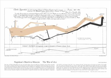
Edward Tufte says that the graph/map above is the best graphic ever drawn. His criterion is how much information is communicated per unit of ink. (Sort of a signal to noise ratio?)
The tan line that starts thick on the left, and gets thinner toward the right, represents Napoleon’s army as it enters and crosses Russia. The width of the line is scaled to the remaining size of the army. On the right hand side, the tan line ends in Moscow, where the army disastrously wintered. The black line moving left shows the diminishing size of the army as Napoleon retreated.
When I was a student at Wabash College, I was a determined and vocal advocate of Ayn Rand’s Atlas Shrugged. My economics professor Ben Rogge, was not so enthused. He thought there were better Russian novels to read, and on several occasions, suggested:  ‘Diamond, you should read War and Peace.’
I often did not take Rogge’s advice quickly, but usually I took it eventually.  After leaving Wabash, I read War and Peace. Parts of it, I found too much like a soap opera for my taste. But I did find a part that resonated.
Part of Tolstoy’s story is about the Russian general facing Napoleon, who would not fight, but who continued to retreat into the heart of Russia. He was widely castigated as a do-nothing leader. But as a result of the Russian general doing nothing, Napoleon ordered his army further and further into Russia.
It is very hard for leaders in government to do nothing. They will be castigated. But sometimes nothing is exactly the right thing for them to do.
Edward Tufte’s wonderful book is:
Tufte, Edward R.   The Visual Display of Quantitative Information. 2nd ed.   Cheshire, CT:   Graphics Press, 2001.

