

 Source of graph: online version of the NYT commentary quoted and cited below.
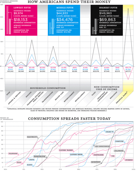
Income inequality is widely derided. But inequality in consumption is more meaningful than inequality in income. The wonderful graph above, and the commentary quoted below, show that consumption per person is much more equal than the usually-used income per household.
(Click on the graph to pop up a larger version that is easier to read.)
(p. 14) It’s true that the share of national income going to the richest 20 percent of households rose from 43.6 percent in 1975 to 49.6 percent in 2006, the most recent year for which the Bureau of Labor Statistics has complete data. Meanwhile, families in the lowest fifth saw their piece of the pie fall from 4.3 percent to 3.3 percent.
Income statistics, however, don’t tell the whole story of Americans’ living standards. Looking at a far more direct measure of American families’ economic status — household consumption — indicates that the gap between rich and poor is far less than most assume, and that the abstract, income-based way in which we measure the so-called poverty rate no longer applies to our society.
For the full commentary, see:
Cox, W. Michael, and Richard Alm. “You Are What You Spend.” The New York Times, Week in Review (Sun., February 10, 2008): 14.
Household size matters of course.
But do you have data that describes the age distribution differences between the three different groups?
That would actually tell the full story.
THANK YOU for this graph.